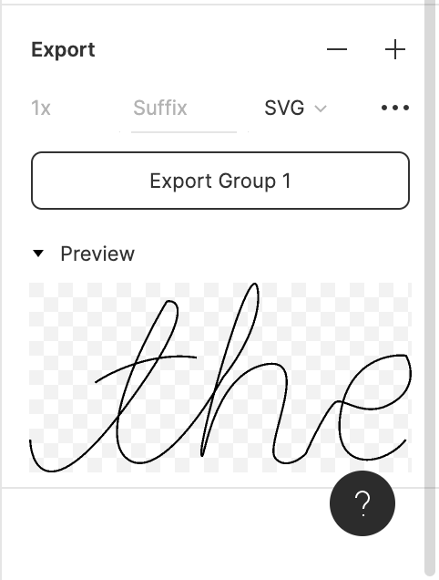
If you want to create a handwriting animation with CSS and SVG like the one below, please keep on reading. Here is the Codesandbox for the example used in this post, you can fork and play around with it!
Let's get started 🎉🎉🎉
✨Creating the SVG✨
First, let us create the SVG drawing which we will be animating.
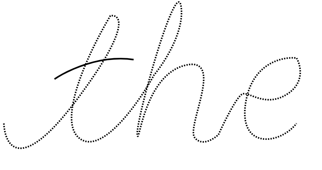
1. Create a guide for our SVG path
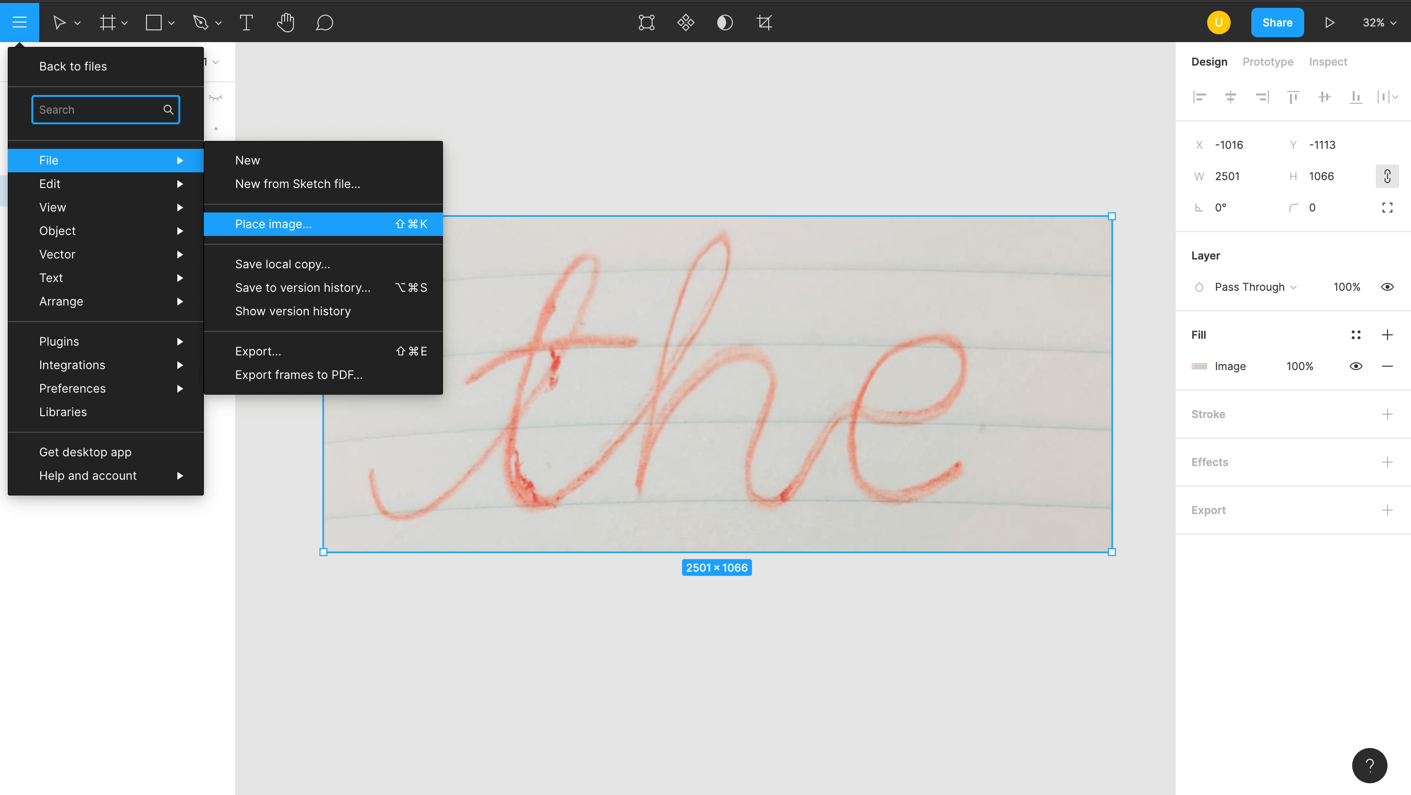
Write down the word that you want to animate on a piece of paper. Click a photograph of it and import the image inside a Figma file. You can find the option to do that inside the menu dropdown > File > Place Image. This will serve as a guide for creating the SVG path. If you are comfortable with drawing the SVG path directly, you can skip this step.
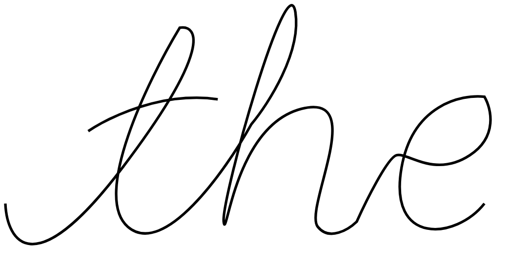
I will be using the word 'the' for this tutorial.
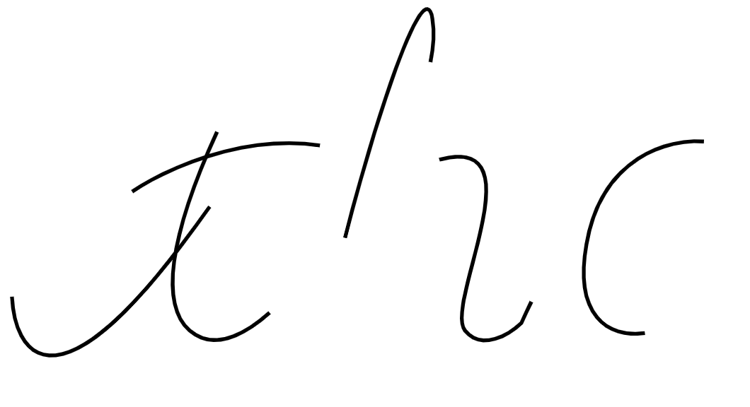
2. Create the SVG using the pen tool
Select the pen tool and start drawing a path on top of the image. If you don't know how to use the pen tool, here's a link to a YouTube tutorial for the same.
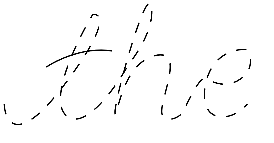
The word 'the' has 2 paths -
- The horizontal dash of the letter 't'
- The word 'the' itself without the horizontal dash.
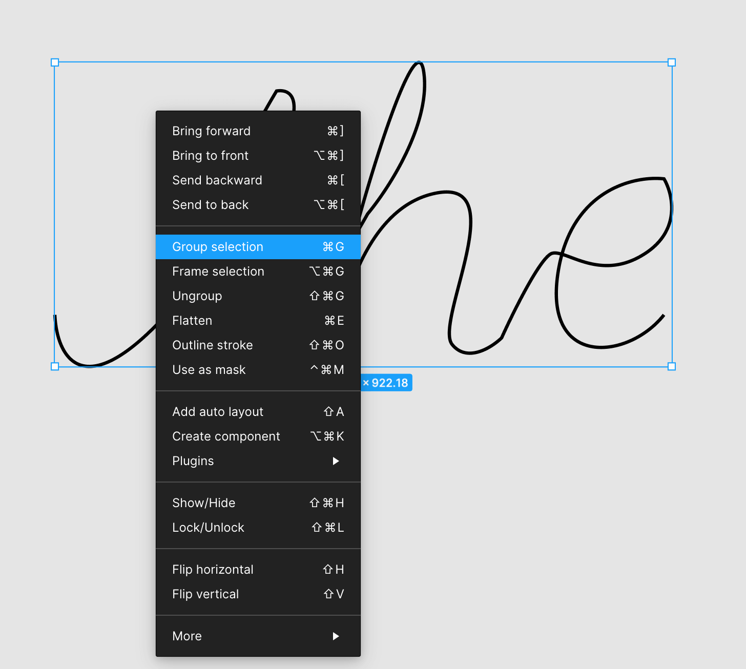
3. Export the paths as a single SVG
Select all the paths and 'Group Selection'.
Now, select the group and click on 'Export' in the menu on the right. Make sure to select the file type as SVG.
✨Time to animate✨
Now, that we have the SVG file ready, it's time to add it to our HTML code and animate it to get the desired effect!
1. Copy and paste the SVG code inside HTML
Here's how my HTML file looks like:
<!DOCTYPE html>
<html>
  <head>
    <title>The Code Dose</title>
    <meta charset="UTF-8" />
  </head>

  <body>
    <svg
      width="500"
      viewBox="0 0 1882 933"
      fill="none"
      xmlns="http://www.w3.org/2000/svg"
    >
      <path
        class="signature__dash"
        d="M325 491.5C403.833 437.167 614.1 336.5 824.5 368.5"
        stroke="black"
        stroke-width="10"
      />
      <path
        class="signature__base"
        d="M5.5 771C12 915.5 111.6 1089.9 458 631.5C804.4 173.1 749 80.8333 678 92C553.5 298.333 339.2 741 478 861C616.8 981 853.167 647 954 465C1020.67 385 1148 186.4 1124 32C1094 -161 837.5 754.5 847.5 841C857.5 927.5 888 471.5 1147.5 405C1407 338.5 1154 791 1210.5 861C1255.7 917 1329.33 871 1360.5 841C1397.17 759.833 1479.1 594.9 1513.5 584.5C1556.5 571.5 1660 674 1796.5 584.5C1905.7 512.9 1879.67 404 1853 358.5C1764.33 348.667 1576.3 389.5 1533.5 631.5C1480 934 1743 910.5 1853 771"
        stroke="black"
        stroke-width="10"
      />
    </svg>
  </body>
</html>
2. Add a unique class / id to the paths
Notice how my SVG code has 2 paths as mentioned above, so I added a unique class to each path. Respectively signature__dash and signature__base.
3. Using stroke-dashoffset and stroke-dasharray
The
stroke-dasharrayproperty in CSS is for creating dashes in the stroke of SVG shapes. The higher the number, the more space in between dashes in the stroke.
To the signature__base class, experiment and figure out a value for property stroke-dasharray such that the entire word is written in a single dash with no space in between.
I experimented with different values - 8, 80, 800, 8000. Finally decided 8000 was good enough for me.
stroke-dasharray: 8
stroke-dasharray: 80
stroke-dasharray: 800
stroke-dasharray: 8000
As you can see above, the value 8000 is perfect for me.
The
stroke-dashoffsetproperty in CSS defines the location along an SVG path where the dash of astrokewill begin. The higher the number, the further along the path the dashes will begin.
4. Adding CSS animations
Add an animation to the signature__base class which makes the stroke-dashoffset property go from 8000 (this should be equal to the stroke-dasharray value from above step) to 0 in 4s or whatever looks better for your animation.
Add a similar animation to all your paths' classes.
At this point, you will be able to see that handwriting effect but it isn't synced yet.
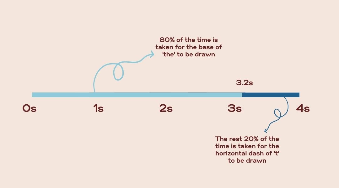
5. Syncing the animations
Now, we want to sync the animations such that the dash of 't' is drawn after the base word is drawn. To achieve that, I set the animation for my base word to finish by 80% of the total animation time i.e. it is drawn from 0% of 4s to 80% of 4s. Next, set the animation of the second path, the dash path to start after 80% of 4s and finish by 100% of 4s.
Done 🎉🎉🎉